

The S&P 500 just hit another all-time high-
And so far it has recorded 28 all-time highs so far in 2026.
But where is the market headed next?

Well, JP Morgan just recently released their Q4 Guide to the Markets.
It's over 71 pages of institutional-grade research with hundreds of charts and data points.
I just went through the entire document and compiled the 7 most important charts for us to review.
Let’s dive in.
1. 📊 Market Valuation
At the January 2022 stock market peak:
S&P 500 forward P/E: 21.4x
10-year Treasury yield: 1.6%
As of the end of September 2026:
S&P 500 forward P/E: 19x
10-year Treasury yield: 5.3%
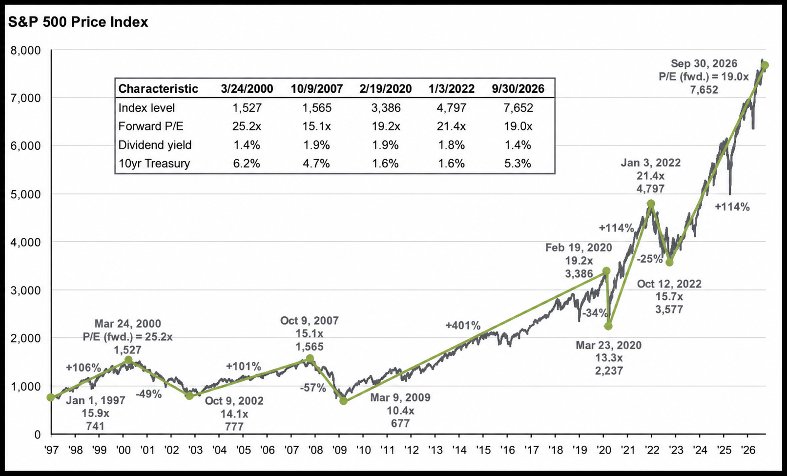
After climbing over 62% since the start of 2022, the market trades at a LOWER forward earnings multiple.
Expected profits have grown faster than stock prices.
The market is cheaper on a forward P/E multiple basis.
However, calling the market “cheaper” based on that comparison alone leaves out something very important:
The competing return available from Treasuries has changed dramatically.
Paying 19x expected earnings when the 10-year yields 5.3% is not automatically a better deal than paying 21.4x when Treasuries yield 1.6%.
The higher Treasury yields have increased the discount rate applied to future cash flows dramatically and also raise the return investors require to justify taking equity risk.
2. 💰 Sources of Returns
I’ve talked often about looking at investments through the lens of sources of returns over the years-
And this chart shows exactly why.
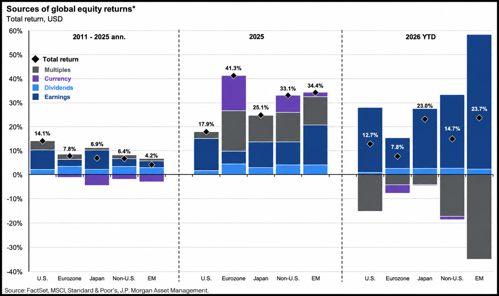
Stocks have climbed in 2026 even as valuation multiples have fallen.
Year-to-date total returns in U.S. dollars:
U.S.: +12.7%
Japan: +23.0%
Emerging markets: +23.7%
Earnings have been the largest positive contributor across every market shown, more than offsetting falling valuation multiples.
3. 💸 Still Historically Expensive
As seen above, rapid earnings growth has led to a decline in valuation multiples.
But even with the S&P 500 at 19x forward earnings, we’re still well above the 30 year average valuation of the market.
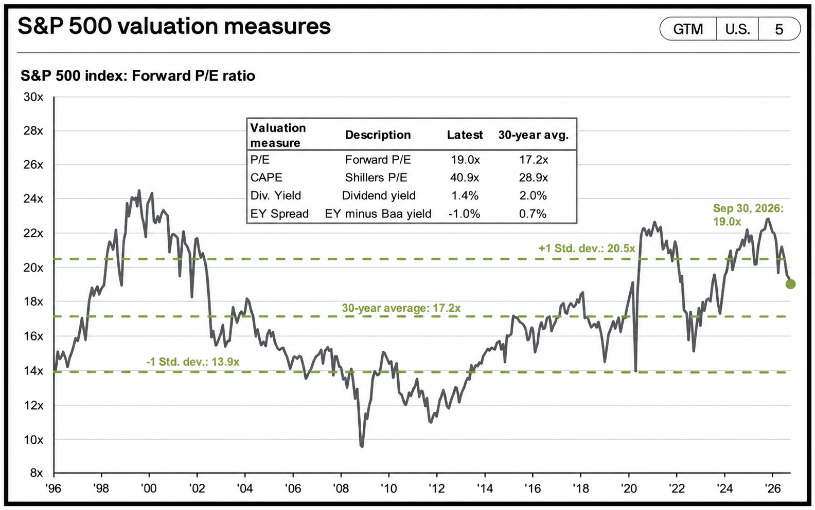
To be fair, this is warranted to some degree.
Businesses have better margins as well as stronger earnings growth.
4. 📉 Market Pull Backs Are Normal
Since 1980, the S&P 500’s average intra-year decline has been 14.2%.
Yet it finished positive in 35 of 46 years.
In 2020, stocks fell 34% during the year and still finished up 16%.
Pullbacks are going to continue to be common moving forward.
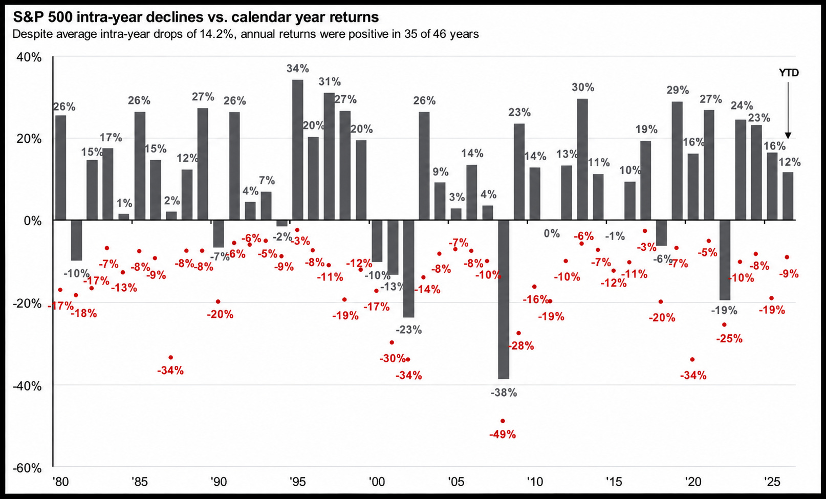
Ultimately, this is why we need to be able to evaluate stocks through the lens of sources of returns.
To put it simply, we need to assess if market pullbacks are due to:
Drops in valuation multiples (which often lead to opportunities)
Drops in earnings (which mean a decline in intrinsic value…(think Nike))
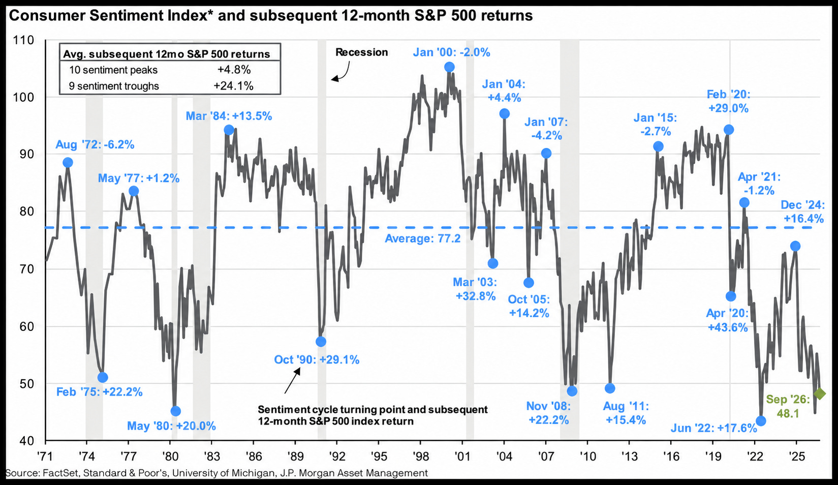
5. 🌡️ Sentiment History Says The Rally Isn’t Over
Investors often feel worst when future returns are most attractive.
What do the average S&P 500 returns over the following 12 months look like when sentiment peaks vs troughs?
After sentiment peaks: +4.8%
After sentiment troughs: +24.1%
September sentiment was just 48.1, which is the second lowest we’ve seen in the last 10 years.
6. 🌎 International Stocks Outperforming?
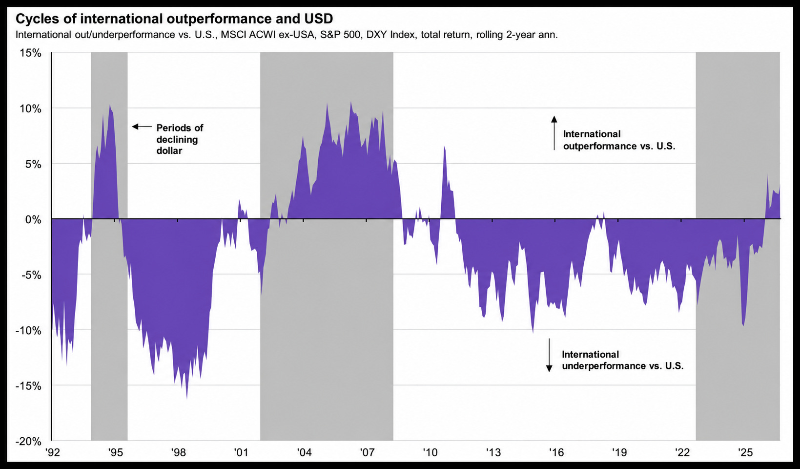
U.S. Stocks just went on a near 15 year run of outperformance relative to international stocks-
But international stocks have seen quite the rally over the last year.
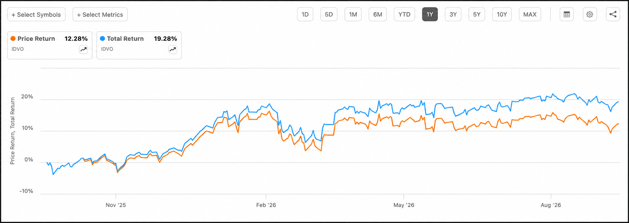
If you’re looking for exposure to international stocks while getting a growing income stream, the Amplify CWP International Enhanced Div Inc ETF (IDVO) is one of my favorite options.
The ETF yields roughly 6%.
It only writes options on roughly 50% of the portfolio, allowing the ETF to take substantial part in the upside of its underling holdings.
This is why the price return over the last year it around 12.3%, but total returns are closer to 19.3%.
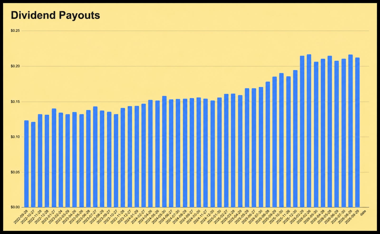
This low portfolio options coverage ratio is also the reason the fund has been able to grow its distributions over time-
As the fund continues to grow its NAV over time.
I interviewed the fund manager for this ETF a couple of months ago, which you can view here.
7. 🎯 Concentrated Growth
While the underlying theme of all these charts is that earnings growth for the market has been exceptionally strong-
That growth has been quite concentrated as of late.
Look at Q3 2026 consensus estimates for year-over-year earnings growth:
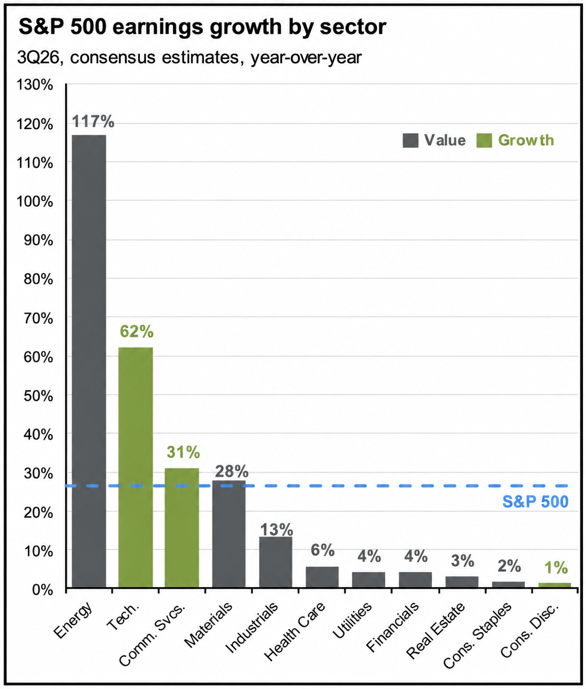
All 11 sectors are expected to grow earnings, but only four sit above the S&P 500’s overall growth rate shown in this chart.
Of course, these are consensus estimates.
Earnings season will show how much of that expected growth actually arrives.
💡 What’s The Takeaway?
There’s one thing that is abundantly clear:
The market is expected to grow earnings at a record rate, and it is priced accordingly.
A failure to meet those EPS expectations would likely cause a substantial drop in valuation multiples.
Higher bond yields also mean we need to be more selective about where we put new capital to work.
Two weeks ago, we added new positions to both our Dividend Growth Portoflio and High Yield Portfolio, which you can read about here.
If you’d like to get access to these portfolios, as well as everything mentioned below, you can do so here:
Check out these resources:
Tickerdata 🚀 (My automated spreadsheets and instant stock data for Google Sheets!)
Interactive Brokers 💰 (My favorite place to buy and sell stocks all around the world!)
Seeking Alpha 🔥 (Research stocks $30 off! + 7 day free trial)
HYSA 📊 (Get Access to the Best High Yield Savings Accounts!)
Great insight .... very informative .... thank you