

Do you want to know something scary?
The S&P 500 has gone through multiple extended periods of time where real returns were negative.
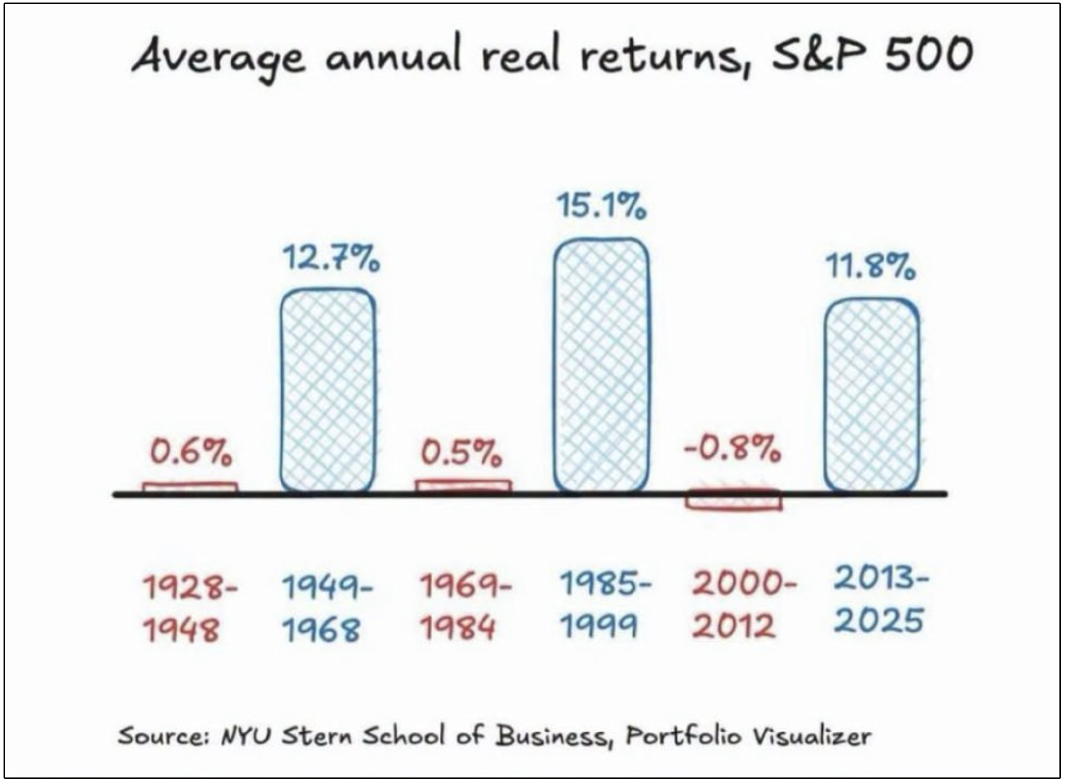
However, the typical response I see to the chart above is a massive mistake.
It usually goes something like this:
“This is cherry-picked data. If you simply dollar-cost averaged during this period, you still would have generated positive returns!”
That statement is absolutely true…
But it also misses the entire point of the chart.
Dollar-cost averaging can be incredibly powerful when you are still earning income and regularly contributing money to your portfolio.
But what happens when the paychecks stop?
📉 The Lost Decade Was Real
From 2000 through 2012, the S&P 500 generated an average annual real return of approximately -0.8%, according to the data shown above.
This period included:
The collapse of the dot-com bubble
The September 11 attacks
The 2008 financial crisis
Two separate bear markets in which stocks fell by roughly 50%
More than a decade of inflation eroding investors’ purchasing power
An investor who continued working throughout this period could keep buying shares at lower prices.
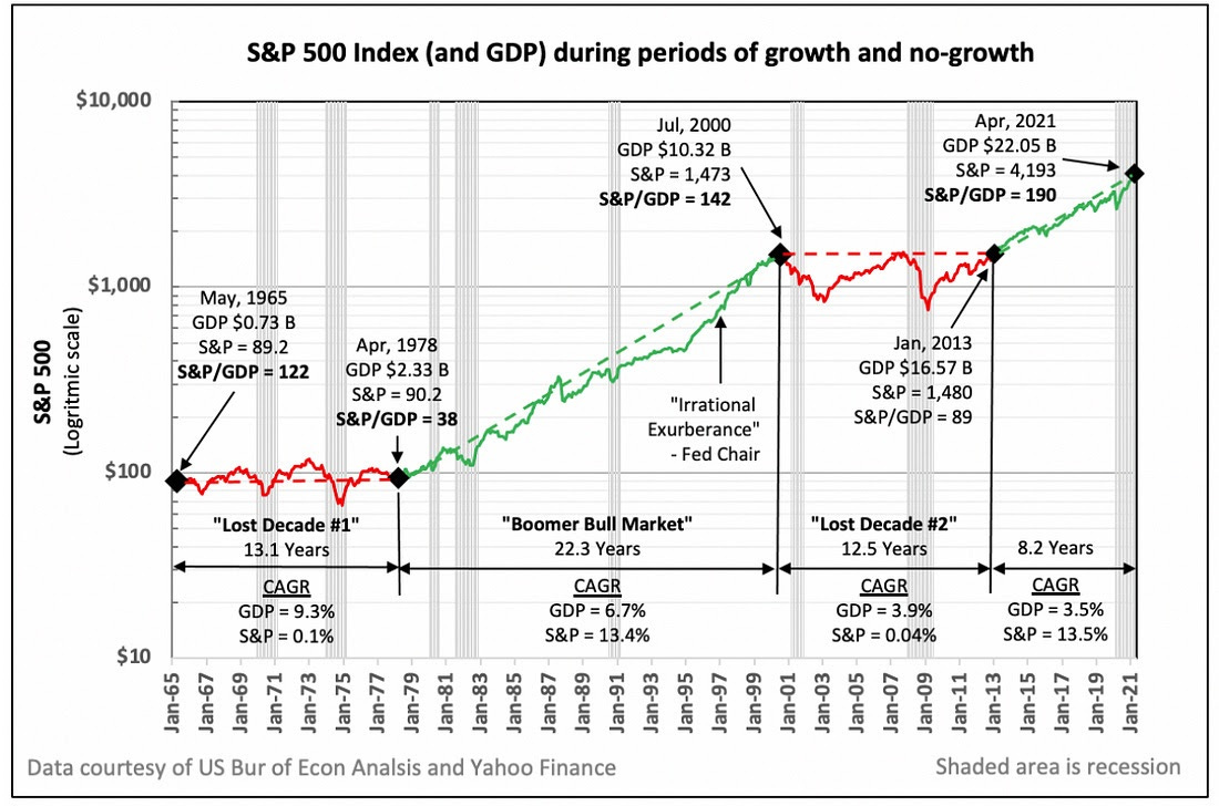
Every contribution purchased more shares while valuations were depressed.
When the market eventually recovered, those additional shares participated in the rebound.
That is exactly what dollar-cost averaging is designed to do.
But a retiree faced the opposite situation.
🏖️ What If You Retired in 2000?
Imagine retiring at the beginning of 2000 with what appeared to be enough money to fund the rest of your life.
You no longer have employment income coming in.
Instead of adding money to your portfolio each month, you must withdraw money to pay for housing, food, healthcare, travel, and other living expenses.
Then the market begins falling.
Your portfolio declines, but your expenses do not disappear.
You still need income, which means you may be forced to sell investments after their prices have already fallen.

When asset prices are depressed, you must sell more shares to generate the same amount of cash.
Those shares are permanently removed from your portfolio.
They cannot generate future dividends
They cannot compound
And they cannot participate in the eventual recovery
The market may recover, but the investor may not.
⚠️ This Is Sequence-of-Returns Risk
Two investors can earn the same average annual return and experience completely different outcomes depending on when the positive and negative returns occur.
For an investor who is still accumulating assets, an early bear market can actually be beneficial.
New contributions purchase more shares at lower valuations.
For a retiree making withdrawals, an early bear market can be devastating.
Losses occurring during the first several years of retirement affect a larger portfolio balance.
When those losses are combined with regular withdrawals, the investor’s capital can become permanently impaired.
This chart shows how dramatically the timing of returns can affect a retiree.
Both portfolios begin with $1 million and experience the exact same returns.
The only difference is that the returns for the first and final years are swapped.
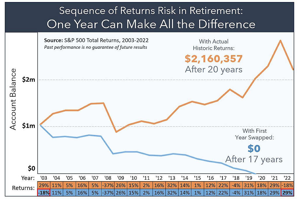
The portfolio beginning with a 29% gain finishes with more than $2.1 million.
The portfolio beginning with an 18% loss runs out of money after 17 years.
The deeper the early losses and the larger the withdrawals, the more difficult the recovery becomes.
This is why the order of your returns can matter just as much as your average return.
🔮 “Cherry-Picked” Is Only Obvious in Hindsight
Calling the year 2000 a cherry-picked starting point misses something important:
Real people invested real money in 2000.
This exact point came up during my recent interview with David Bahnsen, who manages over $10B of capital using a dividend growth strategy at The Bahnsen Group:
“I don’t understand why people think starting right before the cherry-picked notion of a dot-com blowup makes it invalid, as if there weren’t real-life people putting real-life money in at that time. It’s only with the gift of hindsight that we get to say, ‘That’s just because of the timing of the dot-com implosion.’ No one knows what the timing is.”
Nobody retiring at the beginning of that year knew they were approaching a 13-year period of negative inflation-adjusted returns.
Every disastrous historical starting point looks obvious in hindsight.
That is precisely why retirement plans should not depend on markets delivering their long-term average return on schedule.
The S&P 500 may generate attractive returns over several decades, but those returns do not arrive in a straight line.
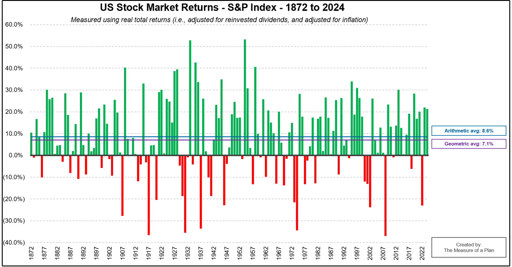
You may experience an extraordinary period like 1985 through 1999, when the market produced average annual real returns of approximately 15.1%.
Or you may experience a period like 2000 through 2012, when inflation-adjusted returns were negative.
🧩 Not All Sources of Return Are Equally Dependable
This second chart is one of the most important charts you will see today.
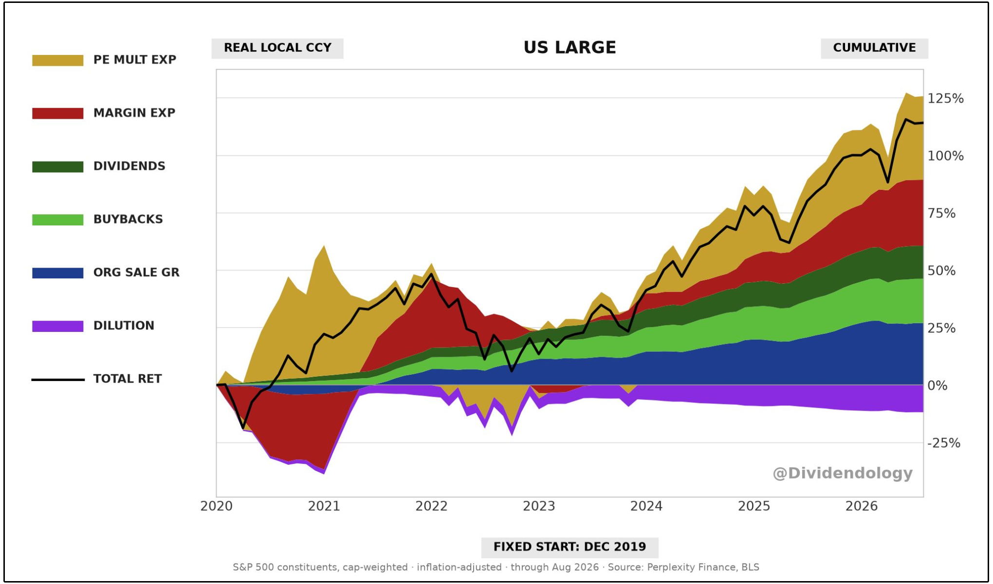
It breaks down the true sources of the S&P 500’s inflation-adjusted return since the beginning of 2020.
Over that period, the S&P 500 generated a cumulative real return of approximately 114%.
That return came from six different sources:
Organic sales growth: +27 percentage points
Margin expansion: +29 percentage points
P/E multiple expansion: +36 percentage points
Buybacks: +19 percentage points
Dividends: +14 percentage points
Share dilution: -11 percentage points
The total return is certainly strong-
But the path taken to generate that return is even more important to understand, especially for someone depending on a portfolio during retirement.
Take a close look again at what happened in 2022.
Corporate fundamentals continued improving during 2022.
Sales grew.
Companies continued repurchasing shares.
Dividends continued accumulating.
Yet the S&P 500’s cumulative real return since the beginning of 2020 collapsed from roughly 50% to approximately 13%.
Why?
Because valuation multiples were crushed.
Investors became willing to pay substantially less for each dollar of corporate earnings as inflation surged and interest rates increased.
The underlying businesses did not suddenly lose most of the sales growth, dividends, and buybacks they had generated.
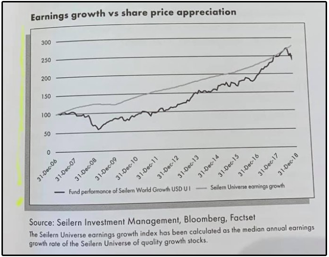
Short term, stock prices follow market sentiment.
Long term, stock prices follow earnings growth.
This is where dividend growth investing has some massive advantages.
Your portfolio value can still fall dramatically when valuations compress.
But if your living expenses are being funded by a sustainable and growing stream of dividends, you aren’t having to sell shares at whatever valuation multiple the market happens to assign them at a given point in time.
🚨 The 4% Rule is More Dangerous Than Ever
On a $1,000,000 portfolio, the 4% rule generates $40,000 in year one, then $41,200 in year two if inflation runs 3%, and so on.
The trinity study found this strategy worked more than 95% of the time on a 30-year retirement horizon.
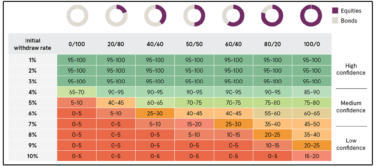
That’s where the “95% success rate” you hear parroted everywhere comes from.
But here’s where things get interesting.
The 95% success rate is a historical average.
It blends together retirees who started in cheap markets with retirees who started in expensive ones.
And when you pull those two groups apart, the story changes dramatically.
Here’s the uncomfortable truth: every single historical failure of the 4% rule happened when stocks were expensive at the start of retirement.
So what does the success rate for the 4% rule look like when also accounting for valuation?
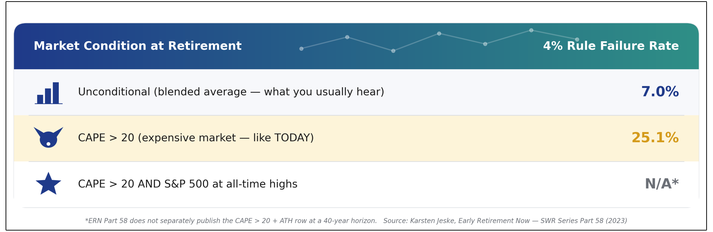
When the CAPE ratio is above 20, the historical failure rate jumps all the way to above 25%!
As a reminder, the CAPE ratio (Cyclically Adjusted Price-to-Earnings) is one of the most widely used ways to measure how expensive the stock market is.
Instead of looking at just one year of earnings like a normal P/E ratio, CAPE looks at the average of the past 10 years of earnings, adjusted for inflation.
So where is the CAPE ratio today?
Sitting at 42.04.
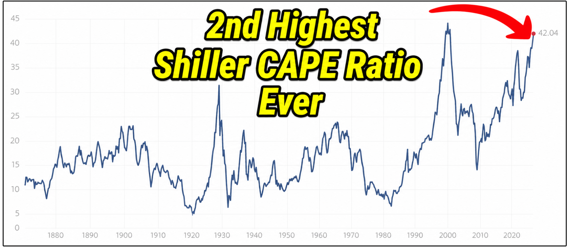
The CAPE ratio is the second highest it has ever been, second only to the dot com bubble.
In other words, we are sitting in exactly the valuation range where the 4% rule has historically broken down.
We don’t even have enough historical data to know what the success rate of the 4% rule would be in this valuation range.
💵 Dividends Are Predictable
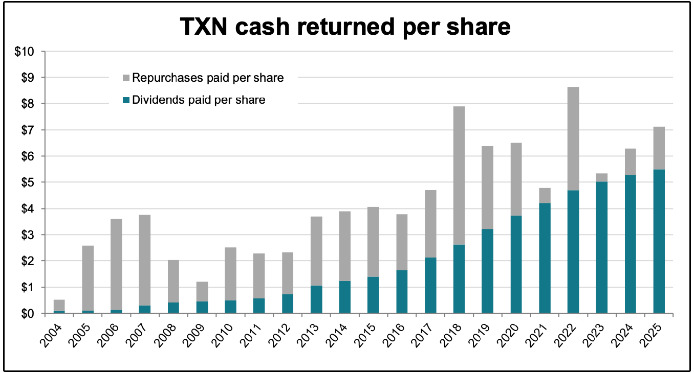
This Texas Instruments chart provides a perfect real-world example of why I believe growing dividends can provide a more predictable foundation for retirement income.
The gray portion represents the value of Texas Instruments’ annual share repurchases per share
The blue portion represents dividends paid per share
I’m a big fan of share buybacks when performed correctly. (That’s a conversation for another day)-
But the simple reality is that Texas Instruments’ buybacks have fluctuated dramatically from year to year.
This tends to be the case for most stocks.
Dividends are by far the most predictable source of return, making them optimal for living off dividends, even during market downturns.
🎯 Build Income Before You Need It
The next lost decade will only be obvious in hindsight.
That is why Dividendology focuses on finding sustainable income supported by durable cash flows, healthy balance sheets, and responsible payout policies.
Members receive access to our model portfolios, complete holdings, trade alerts, in-depth research, and proprietary REIT, BDC, and options-income fund databases.
If you want to be apart of the Dividendology community, and get access pictured below, you can do here:
Tickerdata 🚀 (My automated spreadsheets and instant stock data for Google Sheets!)
Interactive Brokers 💰 (My favorite place to buy and sell stocks all around the world!)
Seeking Alpha 🔥 (Research stocks $30 off! + 7 day free trial)
HYSA 📊 (Get Access to the Best High Yield Savings Accounts!)
Well, as a 60 yo looking at retirement in a couple of years, this scares the crap out of me!! Your premise was that we can protect ourselves by building an income stream using dividends. I have subscribed to your stack to learn about this. My question relates to how the scary charts that you shared look if the investor had been in dividend stocks during some of these downturns.
The contrast between dollar-cost averaging while working and forced selling in retirement is the key point, since withdrawals during a drawdown permanently remove the shares that would have caught the recovery. A cash or income buffer covering the first few years seems to matter more than the exact withdrawal percentage.